Caution
You're reading the documentation for a development version. For the latest released version, please have a look at 0.11.0.
Note
Go to the end to download the full example code.
Rainbowgrams
This notebook demonstrates how to use “Rainbowgrams” to simultaneously visualize amplitude and (unwrapped) phase (differential) as demonstrated in the NSynth paper [1].
# Code source: Brian McFee
# License: ISC
Standard imports
import numpy as np
import matplotlib.pyplot as plt
import librosa
We implemented a stft method to visualize the rainbowgram and demonstrated the result with a chirp signal. A chirp signal starts at a low frequency and gradually increases in frequency over time. We then separated the magnitude and phase components of the signal
sr = 22050
y = librosa.chirp(fmin=32, fmax=32 * 2**5, sr=sr, duration=10, linear=True)
D = librosa.stft(y)

# For rainbowgrams, we'll also need a separate array to represent the magnitude of the STFT.
# Here we'll measure it in decibels, and scale it to the range of [0, 1].
mag = librosa.amplitude_to_db(np.abs(D), ref=np.max)
alpha = (mag - mag.min()) / (mag.max() - mag.min())
librosa.display.specshow can be used to visualize the phase structure from the STFT directly
by using the vscale=’dphase’ argument.
This mode is used to visualize how the phase at each time-frequency location compares to what
would be expected for a sinsuoid at that frequency compared to the phase at the previous time step.
fig, ax = plt.subplots()
img = librosa.display.specshow(D,
                         vscale='dphase',
                         cmap='hsv',
                         alpha=alpha,
                         ax=ax,
                         y_axis='log',
                         x_axis='time')
ax.set_facecolor('#000')
librosa.display.colorbar_phase(img)
plt.show()
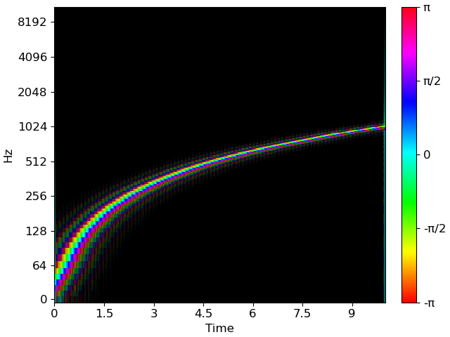
The above uses HSV colormap for phase, fading to a black background in quiet regions, and essentially replicates the ‘rainbowgram’ visualization from the NSynth paper. The center color (0, cyan) corresponds to a frequency matching the STFT’s analysis frequency closely, while red values (±π) represent significant deviation from the center frequency.
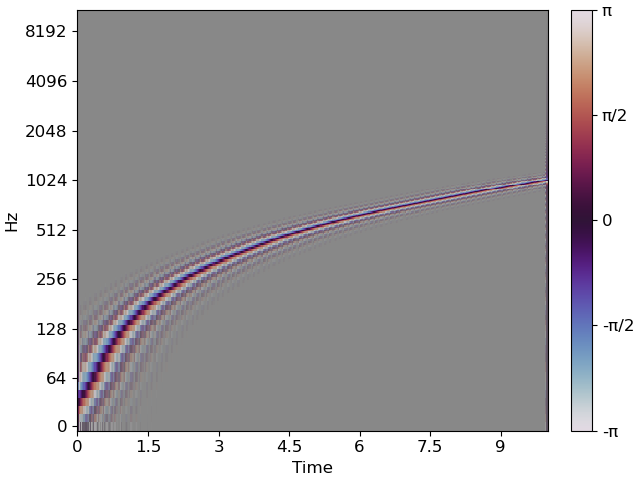
The HSV colormap does have abrupt perceptual transitions in brightness, and is not symmetric around its center point, so the resulting visualization may be misleading in some cases. We can instead use the twilight_shifted colormap, which is designed to be perceptually uniform, with a neutral color (gray) at the center value (0), diverging to red and blue at the extremes (±π). This colormap is the default for the vscale=’dphase’ mode, but we can also use it explicitly.
Because the twilight_shifted colormap has dark values at the extremes, it can be easier to see if the background is a neutral gray color, rather than black.
fig, ax = plt.subplots()
img = librosa.display.specshow(D,
                         vscale='dphase',
                         cmap='twilight_shifted',
                         alpha=alpha,
                         ax=ax,
                         y_axis='log',
                         x_axis='time')
ax.set_facecolor('#888')
librosa.display.colorbar_phase(img)
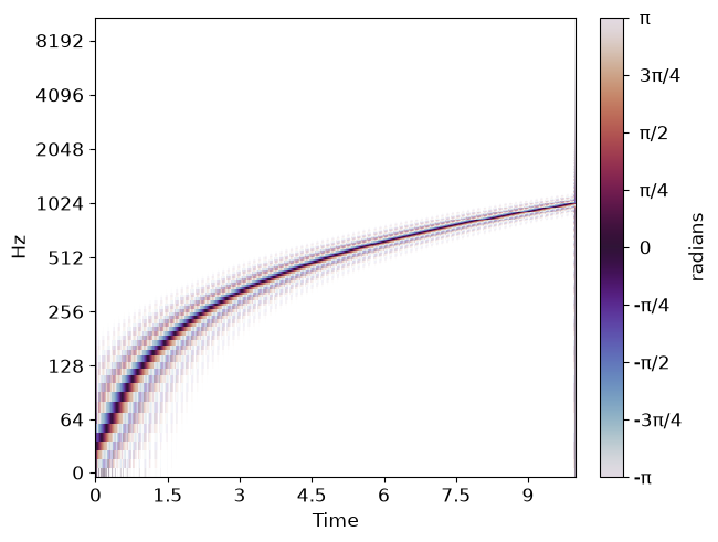
For printed material, it may be preferable to use a white background and invert the colormap. This can be done using the regular twilight colormap, which has a dark center value (0) and diverges to light colors at the extremes (±π).
fig, ax = plt.subplots()
img = librosa.display.specshow(D,
                         vscale='dphase',
                         cmap='twilight',
                         alpha=alpha,
                         ax=ax,
                         y_axis='log',
                         x_axis='time')
ax.set_facecolor('#fff')
librosa.display.colorbar_phase(img)
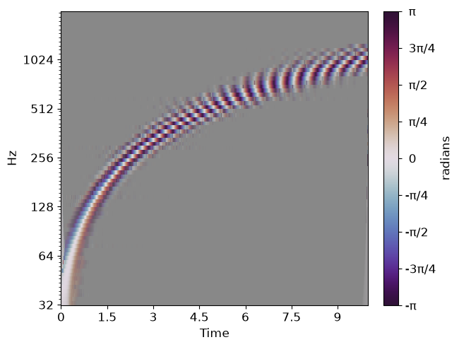
Similar phase structure plots can also be generated from other complex-valued transforms, such as the CQT. The vscale=’dphase’ will work with whatever time-frequency grid is provided by the x_axis and y_axis arguments.
C = librosa.cqt(y, sr=sr, n_bins=12*6, bins_per_octave=12)
C_mag = librosa.amplitude_to_db(np.abs(C), ref=np.max)
alpha_cqt = (C_mag - C_mag.min()) / (C_mag.max() - C_mag.min())
fig, ax = plt.subplots()
img = librosa.display.specshow(C,
                         vscale='dphase',
                         cmap='twilight_shifted',
                         alpha=alpha_cqt,
                         ax=ax,
                         bins_per_octave=12,
                         y_axis='cqt_hz',
                         x_axis='time')
ax.set_facecolor('#888')
librosa.display.colorbar_phase(img)
Total running time of the script: (0 minutes 6.270 seconds)