

Note
Go to the end to download the full example code.
Timbre and spectral content#
This section introduces common tools for representing the timbral or textural content of audio signals.
What is timbre?#
Earlier sections focused on pitch, harmony, and rhythm. Here we turn to timbre: the aspects of sound that make two instruments playing the same notes sound different. Compared to the earlier topics we’ve examined, timbre is harder to pin down conceptually with a clean definition. As a result, the analysis in this section will be a bit more exploratory and data-driven than purely computational. By the end of this section, you should have a better understanding of how basic signal representations (e.g. the STFT) capture both pitch and timbre, and why disentangling these concepts takes a bit of extra work.
Warning
If you’re not previously familiar with concepts like nearest neighbors and dimensionality reduction, you might want to read up on those topics before continuing with this tutorial section. The scikit-learn documentation is a good place to start:
To study timbre, we want examples where pitch and timing are held roughly constant while the instrument changes. For that, we use an excerpt from the ChoraleBricks dataset, augmented with piano and synthesized strings. Each instrument is stored in a separate channel of the same audio file.
For context, we can listen to each instrument in isolation:
import numpy as np
import matplotlib.pyplot as plt
import librosa
from IPython.display import Audio, HTML
y, sr = librosa.loadx("drese", mono=False)
HTML(librosa.util.example_info("drese", html=True))
instruments = ["Alto Sax", "Clarinet", "Trumpet", "Piano", "Synth string"]
n_instruments = len(instruments)
html_content = ""
for i, instrument in enumerate(instruments):
audio_widget = Audio(y[i], rate=sr)._repr_html_()
html_content += f"<div><strong>{instrument}:</strong><br>{audio_widget}</div><br>"
# Must be the final statement evaluated in this script block
HTML(html_content)
which we can visualize as follows:
fig, ax = plt.subplots(nrows=n_instruments, sharex=True, layout="constrained",
figsize=(8, 3))
librosa.display.multiplot("waveshow", y, sr=sr, invert=True, labels=instruments, axes=ax)
fig.legend(loc="outside right center")
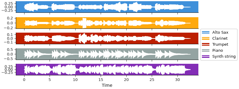
Some differences in dynamics might be apparent already, but probably not much else. To get a better sense of how the instruments differ from each other, we can look at their spectrograms.
stft = librosa.stft(y)
fig, ax = plt.subplots(nrows=n_instruments, sharex=True, sharey=True,
figsize=(10, 6), gridspec_kw=dict(hspace=0.05, wspace=0.05))
imgs = librosa.display.multiplot("specshow", stft, vscale="dBFS", sr=sr,
x_axis="time", y_axis="log", axes=ax)
for i, inst in enumerate(instruments):
ax[i].set(ylabel=inst)
librosa.display.colorbar_db(imgs[0], ax=ax, pad=0.01)
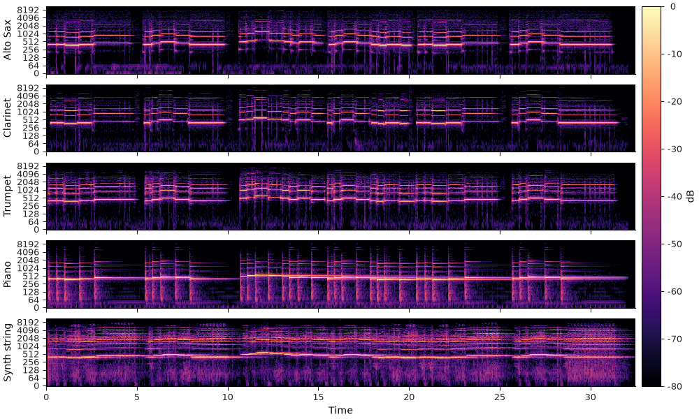
We can now start to observe some specific differences between the instruments, especially if we focus on how the energy is distributed as different harmonics of the fundamental frequency at any given time.
Let’s zoom in on a particular note. The spectra within the slice we’re selecting are mostly stationary, so we can look at the average over time within this slice to more clearly see how the energy is distributed across the harmonics of the fundamental frequency.
fig, ax = plt.subplots(nrows=5, ncols=2, sharex="col", sharey=True,
figsize=(10, 8), gridspec_kw=dict(hspace=0.05, wspace=0.05,
width_ratios=[3, 1]))
imgs = librosa.display.multiplot("specshow", stft, vscale="dBFS", sr=sr,
x_axis="time", y_axis="log", axes=ax[:, 0])
for i, inst in enumerate(instruments):
ax[i, 0].set(ylabel=inst)
time_slice = (7.9, 10.2) # seconds
ax[0, 0].set(xlim=time_slice) # Zoom in to the time slice
# Convert time in seconds to frame indices
frames = librosa.time_to_frames(time_slice, sr=sr)
# Aggregate over time
avg_spec = np.mean(np.abs(stft[..., frames[0]:frames[1]]), axis=-1)
# Get the frequency range for our plot
freqs = librosa.fft_frequencies(sr=sr)
for i in range(n_instruments):
# Scale to dB and plot on the same axes as the spectrogram
# We'll clip to 60dB below peak to focus on the most prominent parts of the spectrum
ax[i, 1].plot(librosa.amplitude_to_db(avg_spec[i], ref=np.max, top_db=60),
freqs, color=f"C{i}")
ax[0, 0].set(title="Spectrogram")
ax[0, 1].set(title="Average spectrum")
ax[-1, 1].set(xlabel="dB")
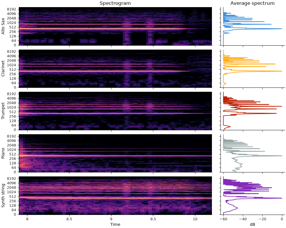
All of our instruments have energy peaks at the same set of frequencies, but the relative amount of energy differs among them. This contributes to the different timbral characteristics of each instrument, and is what we will be exploiting to distinguish between them.
Similarity#
In the plot above, we illustrated the average spectrum over a stationary region of the signal(s), and saw that different instruments have different spectral shapes even when playing the same note. We can extend this idea by looking not at averages, but at each frame individually. We can think of each frame as being represented by a vector of spectral magnitudes (one for each frequency), and we can then compare two frames by distance between these vectors. If two frames have similar spectral shapes, then they should have similar sounds, and vice versa.
As a first attempt at representing timbre, we can use the STFT magnitude spectra, building directly on the intuition behind our example above. With librosa’s default STFT settings, we have 1025 frequency bins, which means that each frame is represented by a 1025-dimensional vector. This is difficult to visualize directly, so we’ll use the UMAP dimensionality reduction method to map the data down to two dimensions for visualization. Our goal here is not to build a classifier yet, but to get an intuition for which representations group similar timbres together.
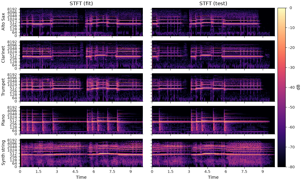
Because UMAP uses a sample of data to estimate the dimensionality reduction, it will be helpful to have some held-out data to illustrate how well the method generalizes to previously unseen data. We’ll accomplish this by splitting the signal in time, using the first 10 seconds to estimate the UMAP projection, and another 10 second slice to evaluate how well the projection generalizes to new data.
import umap
y_fit, sr = librosa.loadx("drese", mono=False, duration=10)
y_test, _ = librosa.loadx("drese", mono=False, offset=-10)
Now let’s first see how well the basic short-time Fourier transform works, using dB scaling on the amplitudes.
We’ll be reusing this plotting code below, so we’ll put it in a function to avoid repetition.
def minmax_normalize(x, axis=-1):
# This function scales the input to the range [0, 1], which we'll use for mapping
# frame amplitudes into alpha values for scatter plots below.
return (x - np.min(x, axis=axis, keepdims=True)) / (np.max(x, axis=axis, keepdims=True) - np.min(x, axis=axis, keepdims=True))
def scatter_outline(ax, x, y, alpha, s, zorder, color=None, **kwargs):
# We'll use a subtle stroke effect to help the individual data points stand out
# This idea is borrowed from the `matplotlib handouts
# <https://matplotlib.org/cheatsheets/>`_.
ax.scatter(x, y, color="k", s=s, lw=1, zorder=-10, alpha=1)
ax.scatter(x, y, color="w", s=s, lw=0, zorder=-5)
return ax.scatter(x, y, color=color, alpha=alpha * 0.5, lw=0, s=s, zorder=zorder, **kwargs)
def plot_umap(data_fit, data_test, alpha_fit, alpha_test, ax):
# Fixing the random state and number of jobs to ensure reproducibility
reducer = umap.UMAP(random_state=5, n_jobs=1)
# We need to reshape the data so that each time frame is a sample, and the frequency bins are
# features.
embed_fit = reducer.fit_transform(data_fit.transpose(0, 2, 1).reshape(-1, data_fit.shape[1]))
embed_test = reducer.transform(data_test.transpose(0, 2, 1).reshape(-1, data_test.shape[1]))
n_fit = data_fit.shape[-1]
n_test = data_test.shape[-1]
# min-max normalize the alpha values for fit and test
# Then reshape so we can use them in the scatter plot
alpha_fit = minmax_normalize(alpha_fit).transpose(0, 2, 1).reshape(-1)
alpha_test = minmax_normalize(alpha_test).transpose(0, 2, 1).reshape(-1)
# Now plot the results, coloring by instrument label:
for i in range(n_instruments):
idx_fit = slice(i * n_fit, (i+1)*n_fit)
idx_test = slice(i * n_test, (i+1)*n_test)
scatter_outline(ax, embed_fit[idx_fit, 0], embed_fit[idx_fit, 1], alpha=alpha_fit[idx_fit], s=10, zorder=10,
color=f"C{i}", marker="o", label=f"{instruments[i]} (fit)")
scatter_outline(ax, embed_test[idx_test, 0], embed_test[idx_test, 1], alpha=alpha_test[idx_test], s=30, zorder=5,
color=f"C{i}", marker="o", label=f"{instruments[i]} (test)")
ax.set(xticks=[], yticks=[]) # X and Y axes are arbitrary units, so we can hide the ticks
# Fix the alpha channels in the legend for legibility
fig = ax.get_figure()
leg = fig.legend(loc="outside right center")
for lh in leg.legend_handles:
lh.set_alpha(np.ones_like(lh.get_alpha()))
# Return the umap embeddings, in case we want to do other things with them
return embed_fit, embed_test
Now we can compute the STFT magnitudes in decibel scale:
stft_fit = librosa.amplitude_to_db(np.abs(librosa.stft(y_fit)), ref=np.max)
stft_test = librosa.amplitude_to_db(np.abs(librosa.stft(y_test)), ref=np.max)
fig, ax = plt.subplots(nrows=n_instruments, ncols=2, sharex="col", sharey=True,
figsize=(10, 6), gridspec_kw=dict(hspace=0.05, wspace=0.05))
imgs = librosa.display.multiplot("specshow", stft_fit, sr=sr,
x_axis="time", y_axis="log", axes=ax[:, 0])
librosa.display.multiplot("specshow", stft_test, sr=sr,
x_axis="time", y_axis="log", axes=ax[:, 1])
ax[0, 0].set(title="STFT (fit)")
ax[0, 1].set(title="STFT (test)")
for i, inst in enumerate(instruments):
ax[i, 0].set(ylabel=inst)
librosa.display.colorbar_db(imgs[0], ax=ax, pad=0.01)
Now instead of plotting the spectrograms directly, we’ll use the functions defined above to transform each frame (1025-dimensional vector) into a point in two dimensions so that we can understand the geometry relationships between different frames in the input signals. We’ll use transparency to encode amplitude, so that quiet parts of the signal do not contribute visual clutter, and otherwise color-code each frame by its instrument:
alpha_fit = np.mean(stft_fit, axis=1, keepdims=True)
alpha_test = np.mean(stft_test, axis=1, keepdims=True)
fig, ax = plt.subplots(layout="constrained")
embed_fit, embed_test = plot_umap(stft_fit, stft_test, alpha_fit, alpha_test, ax)
ax.set(title="STFT magnitude UMAP projection")
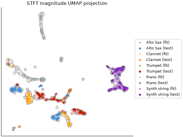
In the plot above, each data point corresponds to a single frame of a recording. If two frames are close in the plot, they have similar spectral magnitudes. If our representation is working well to separate instruments, then we should see distinct clusters of points corresponding to each instrument (coded by color). Indeed, some but not all of our instruments are well separated in the STFT magnitude space.
There is however quite a bit of crowding in some parts of the space: this is because the STFT similarity tends to be dominated by agreement in pitch content (e.g., fundamental frequency) rather than the overall shape of the spectrum independent of f0. That is, two distinct instruments playing the same note will likely be close to each other in this representation, making it a poor choice for representing timbre independent of pitch. To see that, we can plot the same UMAP projection again, but now coloring by fundamental frequency instead of instrument label:
# Estimate the fundamental frequency (f0) for each frame using the pyin algorithm.
f0_fit, voiced_flag_fit, voiced_probs_fit = librosa.pyin(y_fit, fmin=100, fmax=1000, sr=sr)
f0_test, voiced_flag_test, voiced_probs_test = librosa.pyin(y_test, fmin=100, fmax=1000, sr=sr)
# Re-plot the UMAP embeddings of the STFT magnitudes, now coloring by f0 instead of instrument class
fig, ax = plt.subplots(layout="constrained")
scatter_outline(ax, embed_fit[:, 0], embed_fit[:, 1], c=f0_fit.flatten(), alpha=voiced_flag_fit.flatten(), s=10, zorder=10,
marker="o", label="Fit", cmap="turbo_r")
points = scatter_outline(ax, embed_test[:, 0], embed_test[:, 1], c=f0_test.flatten(), alpha=voiced_flag_test.flatten(), s=30, zorder=5,
marker="o", label="Test", cmap="turbo_r")
ax.set(title="STFT magnitude UMAP projection colored by f0")
fig.colorbar(points, label="f0 (Hz)")
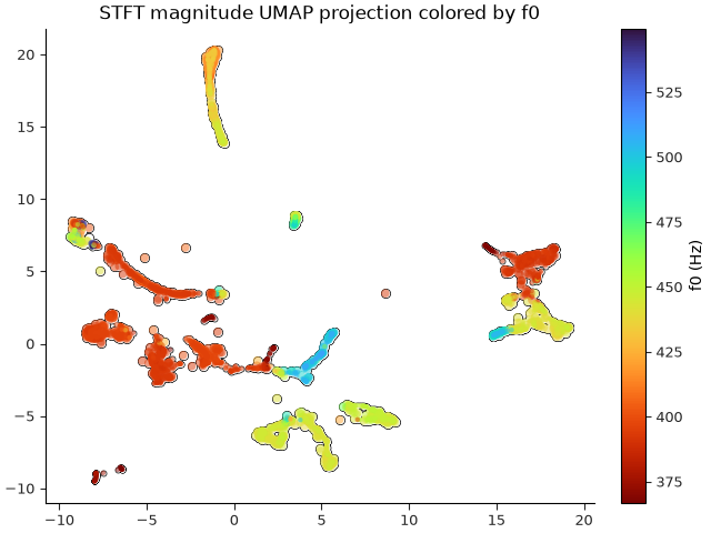
Comparing the previous two plots, we can see in the first plot that some of the clusters of points include examples from multiple instruments (mixtures of colors), but in the second plot, those same clusters are mostly homogeneous in pitch. This tells us that the STFT similarity is indeed more indicative of pitch similarity than timbral similarity.
Mel spectra#
A first step toward a more timbre-focused representation is to transform the frequency range into something that better aligns with human perception of frequency. For this, we’ll use the Mel scale, which you can think of as an approximately logarithmic transformation of the frequency axis, coupled with a dimensionality reduction to group nearby frequencies together.
Mel spectrograms are computed in librosa by librosa.feature.melspectrogram:
mel_fit = librosa.feature.melspectrogram(y=y_fit, sr=sr)
mel_test = librosa.feature.melspectrogram(y=y_test, sr=sr)
# Mel spectra, by default, are computed in power units instead of amplitude, so we'll use
# the power_to_db converter instead here.
mel_fit_db = librosa.power_to_db(mel_fit, ref=np.max)
mel_test_db = librosa.power_to_db(mel_test, ref=np.max)
Mel spectrograms look pretty much like STFT’s, but with vastly fewer frequency bins:
print(f"STFT shape (instruments, frequencies, frames): {stft_fit.shape}")
print(f"Mel spectrogram shape: {mel_fit_db.shape}")
fig, ax = plt.subplots(nrows=n_instruments, ncols=2, sharex="col", sharey=True,
figsize=(10, 6), gridspec_kw=dict(hspace=0.05, wspace=0.05))
imgs = librosa.display.multiplot("specshow", mel_fit, vscale="dBFS[power]", sr=sr,
x_axis="time", y_axis="mel", axes=ax[:, 0])
librosa.display.multiplot("specshow", mel_test, vscale="dBFS[power]", sr=sr,
x_axis="time", y_axis="mel", axes=ax[:, 1])
ax[0, 0].set(title="Mel spectrogram (fit)")
ax[0, 1].set(title="Mel spectrogram (test)")
for i, inst in enumerate(instruments):
ax[i, 0].set(ylabel=inst)
librosa.display.colorbar_db(imgs[0], ax=ax, pad=0.01)
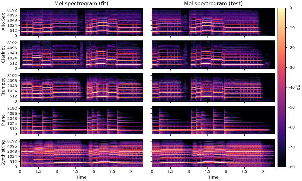
STFT shape (instruments, frequencies, frames): (5, 1025, 431)
Mel spectrogram shape: (5, 128, 431)
And plot the UMAP embeddings from Mel spectra:
fig, ax = plt.subplots(layout="constrained")
plot_umap(mel_fit_db, mel_test_db, alpha_fit, alpha_test, ax)
ax.set(title="Mel spectrogram UMAP projection")
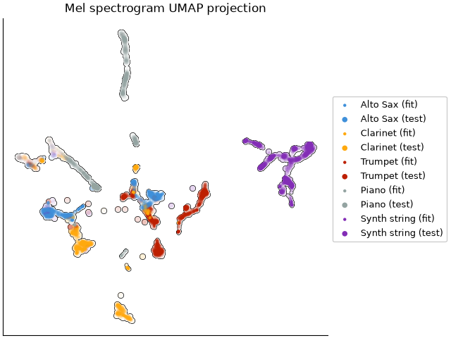
We now have a little more separation between instruments here, but still quite a bit of overlap. This is because the mel spectrogram is still sensitive to pitch; it’s just less sensitive than the STFT because the mel filter bank groups together nearby frequencies.
Mel frequency cepstral coefficients (MFCCs)#
To further reduce sensitivity to the exact fundamental frequency of the signal,
mel frequency cepstral coefficients (MFCCs) are commonly used.
Essentially, these work by projecting each dB-scaled mel spectrum (frame) onto a set of basis
functions which capture the overall shape of the spectrum.
These are computed by librosa.feature.mfcc:
And we can visualize them in a similar fashion to spectrograms, though the interpretation of values and vertical axes are quite different here:
fig, ax = plt.subplots(nrows=n_instruments, ncols=2, sharex="col", sharey=True,
figsize=(10, 6), gridspec_kw=dict(hspace=0.05, wspace=0.05))
imgs = librosa.display.multiplot("specshow", mfcc_fit, sr=sr,
x_axis="time", axes=ax[:, 0])
librosa.display.multiplot("specshow", mfcc_test, sr=sr,
x_axis="time", axes=ax[:, 1])
ax[0, 0].set(title="MFCC (fit)")
ax[0, 1].set(title="MFCC (test)")
for i, inst in enumerate(instruments):
ax[i, 0].set(ylabel=inst)
librosa.display.colorbar_db(imgs[0], ax=ax, pad=0.01)
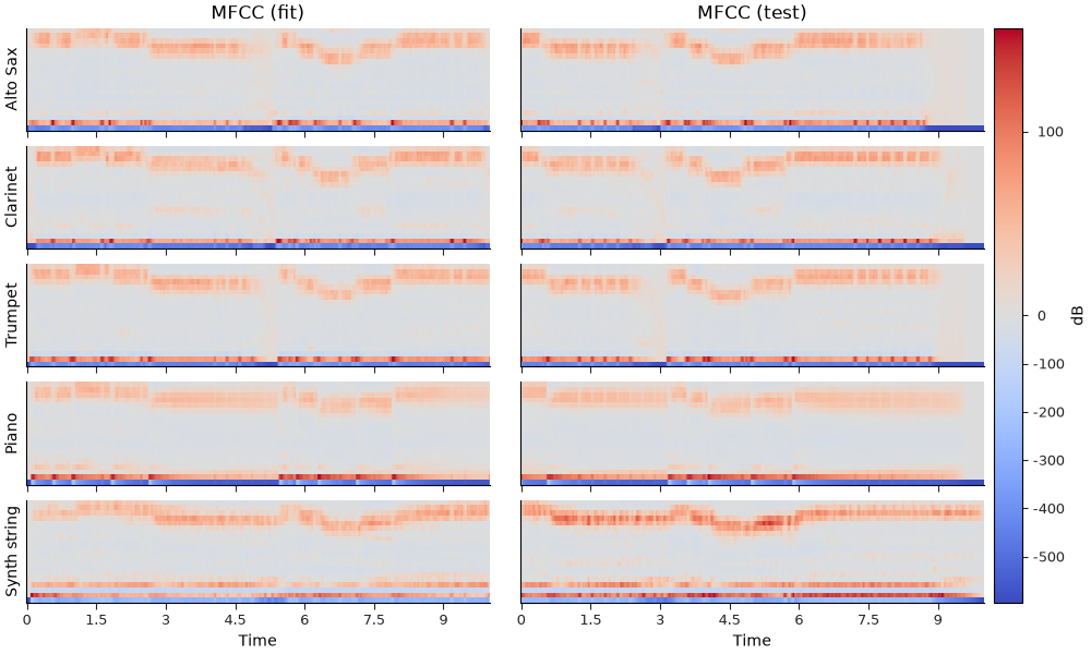
A few things to note here:
The vertical axis does not correspond to frequency, but rather the response of each basis function applied to the spectrum.
The values here can be positive or negative, and the sign matters.
The scale of values tends to be much larger for lower coefficients, and smaller for higher coefficients.
Without going into the details of the calculation, the first coefficient (bottom row of each subplot above) captures the overall amplitude over time. The second coefficient captures the energy balance between low and high frequencies; the third coefficient captures the balance between the middle frequencies and the extremes (high and low together); and so on.
The basic idea here is to describe the general shape of the spectrum, not the fine details. For this reason, MFCCs are typically restricted to a small number of coefficients (e.g., 13 or 20), which is much smaller than the number of mel bins or STFT bins.
print(f"MFCC shape: {mfcc_fit.shape}")
print(f"Mel spectrogram shape: {mel_fit_db.shape}")
print(f"STFT shape: {stft_fit.shape}")
MFCC shape: (5, 20, 431)
Mel spectrogram shape: (5, 128, 431)
STFT shape: (5, 1025, 431)
Let’s see how well the MFCCs do at separating our instruments:
fig, ax = plt.subplots(layout="constrained")
plot_umap(mfcc_fit, mfcc_test, alpha_fit, alpha_test, ax)
ax.set(title="MFCC UMAP projection")
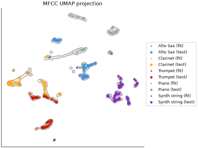
While the MFCC representation is definitely not perfect, it is doing a better job of reducing overlap between instrument clusters.
Quantitative evaluation#
To get a more quantitative sense of how well these different representations separate our instruments, we can use a simple k-nearest neighbor classifier to predict the instrument label of each frame in the test set based on the closest frame in the fit set, and then compute a classification report based on the true and predicted labels. Note that this classification is performed in the original feature space (e.g., STFT, Mel, or MFCC), not the UMAP space, so it is not directly related to the UMAP visualizations above. Rather, it is meant as a quantitative check to ensure that the visualizations are not misleading us.
import sklearn.neighbors
import sklearn.metrics
import pandas as pd
# Limit dataframe precision to 2 decimal places for better readability
pd.set_option("display.precision", 2)
def knn_eval(data_fit, data_test):
n_fit = data_fit.shape[-1]
n_test = data_test.shape[-1]
# Create labels for each instrument's frames
labels_fit = np.repeat(np.arange(n_instruments), n_fit)
labels_test = np.repeat(np.arange(n_instruments), n_test)
# Reshape the data so that each time frame is a sample, and the frequency bins are features.
X_fit = data_fit.transpose(0, 2, 1).reshape(-1, data_fit.shape[1])
X_test = data_test.transpose(0, 2, 1).reshape(-1, data_test.shape[1])
knn = sklearn.neighbors.KNeighborsClassifier(n_neighbors=1)
knn.fit(X_fit, labels_fit)
pred_labels = knn.predict(X_test)
report = sklearn.metrics.classification_report(labels_test, pred_labels,
target_names=instruments,
output_dict=True)
df = pd.DataFrame(report).transpose()
df["support"] = df["support"].astype(int)
return df
For each of our representations, we can compute a classification report to summarize for each instrument:
Precision: the proportion of frames predicted to be a given instrument that are actually that instrument.
Recall: the proportion of frames of a given instrument that are correctly predicted as that instrument.
F1-score: the harmonic mean of precision and recall, which provides a single metric that balances both precision and recall.
as well as the overall accuracy across all instruments. The higher these values are, the better the representation is at separating the different instruments.
STFT evaluation
Mel evaluation
knn_eval(mel_fit_db, mel_test_db)
MFCC evaluation
Summary#
It is worth noting that although MFCCs have historically been used for timbre analysis and more general, high-level classification of audio signals, they are by now very far from “state of the art”. The examples illustrated here are predominantly monophonic (except for the polyphony produced by the pedal on the piano version), and the recordings are clean and well-aligned, making this an artificial setting in which MFCCs are likely to perform well. That said, it is still instructive to see how these different representations work to eliminate unwanted sensitivity.
It is also worth noting that there are many extensions that could be implemented on top of
this basic MFCC pipeline: for example, we could eliminate the 0th coefficient to remove
sensitivity to overall amplitude, concatenate first- and second-order time differences to
capture temporal dynamics (see librosa.feature.delta), use more powerful classification methods,
and so on.
Total running time of the script: (1 minutes 18.007 seconds)