

Note
Go to the end to download the full example code.
Visualizing non-spectral data#
This section demonstrates how specshow can be used to visualize data other than spectrograms.
The librosa.display.specshow function was designed primarily for displaying spectrograms,
but it is flexible enough to support a variety of other data types and derived features.
As we will see below, data or features to be visualized often share at least one axis (time or frequency)
with spectrograms, and can therefore be displayed using the same interface.
Chroma#
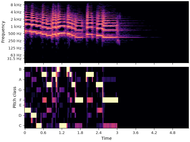
Chroma features, as introduced in the section on harmony, represent harmonic content of a signal, with all pitches reduced to a single octave of pitch classes. Typically the time axis is still equivalent to the time axis of a spectrogram, and only the “frequency” axis is different.
librosa.display.specshow can be used to visualize chroma features in the same way as spectrograms,
just by setting y_axis=’chroma’.
The following example shows a chromagram (bottom) aligned with the corresponding spectrogram (top).
import librosa
import numpy as np
import matplotlib.pyplot as plt
from IPython.display import HTML

y, sr = librosa.loadx("trumpet")
HTML(librosa.util.example_info("trumpet", html=True))
stft = librosa.stft(y)
chroma = librosa.feature.chroma_cqt(y=y, sr=sr, threshold=0.5)

fig, ax = plt.subplots(nrows=2, sharex=True)
librosa.display.specshow(stft, y_axis="log_oct3", x_axis="time", vscale="dBFS", ax=ax[0])
librosa.display.specshow(chroma, y_axis="chroma", x_axis="time", ax=ax[1])
ax[0].label_outer()
/usr/share/miniconda/envs/docs/lib/python3.12/site-packages/numba/np/ufunc/gufunc.py:290: RuntimeWarning: invalid value encountered in cast
  return self.ufunc(*args, **kwargs)
Just like with other notation-related functions, chroma displays can be configured to spell pitches within a given key or mode. For example, we can display the chromagram above in the key of F dorian by setting key=’F:dorian’ in the call to specshow.
fig, ax = plt.subplots(figsize=(6, 3))
librosa.display.specshow(chroma, y_axis="chroma", x_axis="time", key="F:dorian", ax=ax)
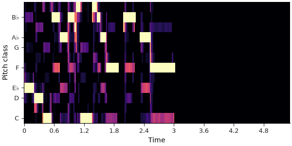
The data here is unchanged - the only difference in the resulting plot is that the vertical tick positions and corresponding labels have been shifted to match that of the specified key.
Tempograms#
Tempograms are a representation which aims to capture the local rhythmic structure of a signal. There are fundamentally two kinds of tempogram: autocorrelation-based and Fourier-based. Both kinds of tempogram share the same time axis as a spectrogram, but the “frequency” axis is replaced with a tempo axis, which for autocorrelation tempograms is measured in units of frame lag (smaller lag corresponding to faster tempo), while Fourier tempograms measure in units of Beats per Minute (BPM). specshow can work with both kinds, as seen below.
y, sr = librosa.loadx("nutcracker", duration=45)
HTML(librosa.util.example_info("nutcracker", html=True))
# First the autocorrelation tempogram
tempo_ac = librosa.feature.tempogram(y=y, sr=sr)

# And now the Fourier tempogram
tempo_ft = librosa.feature.fourier_tempogram(y=y, sr=sr)

fig, ax = plt.subplots(nrows=2, sharex=True)
# Plot the autocorrelation tempogram, but clip negative values to zero for better visualization
librosa.display.specshow(np.maximum(tempo_ac, 0), y_axis="tempo", x_axis="time", ax=ax[0])
librosa.display.specshow(tempo_ft, y_axis="fourier_tempo", x_axis="time",
                         vscale="dBFS", top_db=24, ax=ax[1])
ax[0].label_outer()
ax[0].set(title="Autocorrelation Tempogram")
ax[1].set(title="Fourier Tempogram")
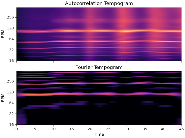
For both kinds of tempogram display, the vertical axis is mapped to units of BPM.
Recurrence plots#
Any axis mode can be applied to either the horizontal (x) or vertical (y) axis of a display. In fact, one can even apply the same axis mode to both axes, which is useful for visualizing recurrence or self-similarity matrices. Recurrence plots are often used in structural analysis of music, and are computed by comparing the signal at each time t to the signal at every other time t’. The result is a square matrix of similarity values, which can be visualized using specshow with the same axis mode on both axes.
In the following example, we’ll compute a recurrence matrix based on the chroma features of a signal, which essentially captures repetitions of harmony at different points in time.
# Compute chroma.  Threshold of 0.5 is mainly for clarity of visualization
chroma = librosa.feature.chroma_cqt(y=y, sr=sr, threshold=0.5)
rec = librosa.segment.recurrence_matrix(chroma, mode="affinity")

fig, ax = plt.subplots(figsize=(4, 4))
# We'll use a reversed grayscale colormap here so that the relatively few positive values are more visible
librosa.display.specshow(rec, y_axis="time", x_axis="time", ax=ax, cmap="gray_r")
ax.set(title="Recurrence Plot")
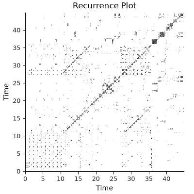
Whenever specshow detects that the same axis mode is being applied on both axes, and the data has equal size along each axis, it will automatically set the aspect ratio of the display to be equal, so that the resulting plot is square.
Most of the time this behavior is desirable, but it can sometimes be useful to override it to allow for more flexible layouts.
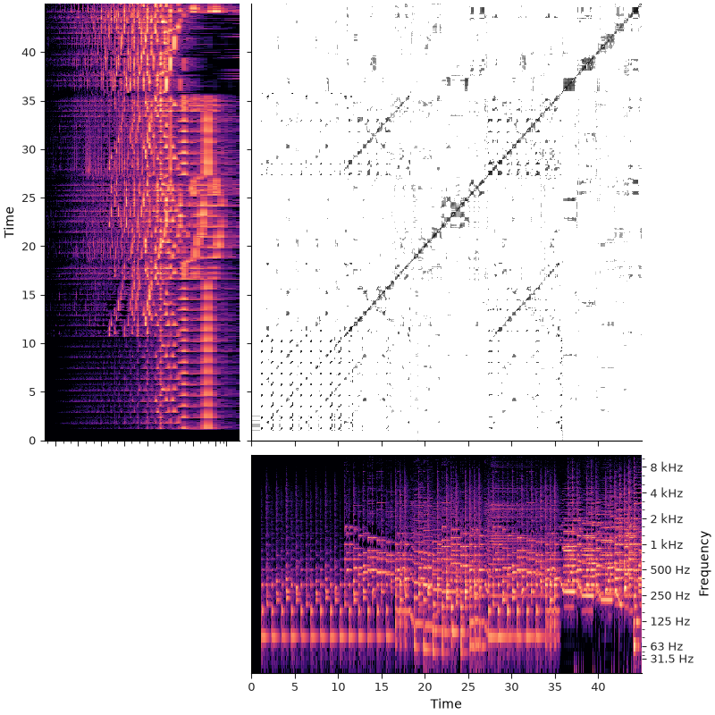
For example, we can extend the above visualization to show the original spectrogram data along with the recurrence plot. We’ll use subplot mosaic to create named subplot axes, and link the axes across related subplots. In this case, forcing a square aspect ratio on the recurrence plot leads to a smaller subplot with more empty space between it and the spectrograms, which can make visual alignment more difficult. By setting auto_aspect=False, we can allow the recurrence plot to fill the available space, while still keeping the axes linked for alignment.
stft = librosa.stft(y)
fig, ax = plt.subplot_mosaic("ABB;ABB;.CC", figsize=(8, 8), layout="compressed")

# Link the axes between subplots
ax["B"].sharey(ax["A"])
ax["B"].sharex(ax["C"])

# We'll put the recurrence plot in the upper-right (B subplot)
librosa.display.specshow(rec, y_axis="time", x_axis="time", ax=ax["B"], auto_aspect=False, cmap="gray_r")

# The regular spectrogram along the bottom (C subplot)
librosa.display.specshow(stft, y_axis="log_oct3", x_axis="time", vscale="dBFS", ax=ax["C"])

# And a transposed copy of the spectrogram along the left (A subplot)
librosa.display.specshow(stft.T, x_axis="log_oct3", y_axis="time", vscale="dBFS", ax=ax["A"])

# Invert the horizontal axis on the transposed spectrogram so that the lowest frequency
# appears on the right side, not the left
ax["A"].invert_xaxis()

# Hide redundant axis labels and ticks on the inner axes
ax["A"].label_outer()
ax["B"].label_outer()
ax["C"].yaxis.tick_right()
ax["C"].yaxis.set_label_position("right")
Summary#
The flexibility of librosa.display.specshow allows it to be used for visualizing
a wide variety of data types and derived features. Although the function appears
at first glance to have a staggering number of parameters, most of them are there
to mirror the parameters of the related signal transformation functions for which
we have built-in support.
Total running time of the script: (0 minutes 6.963 seconds)