

Visualizing audio waveforms#

This section introduces the main ways to visualize audio waveforms in librosa.

What are we visualizing?#

As we’ve seen in the introduction section, a waveform of an audio signal is a sequence of sample values that represent how air pressure changes over time. A natural way to visualize this is to simply plot the sample values as a function of time or sample index using conventional plotting tools in matplotlib.

Note

All of librosa’s display functionality is built on top of matplotlib, and we’ll assume some degree of familiarity with it. If you’re entirely new to plotting with matplotlib, you may want to first take a look at the matplotlib user guide.

import numpy as np
import librosa
import matplotlib.animation as animation
import matplotlib.pyplot as plt
from IPython.display import HTML

# Load the trumpet example at its native sampling rate
y, sr = librosa.loadx("trumpet", sr=None)
HTML(librosa.util.example_info("trumpet", html=True))
solo trumpet 06
By: Mihai Sorohan | License: CC-BY-4.0
Description

Part of "Jazz Trumpet Loops Pack in F 90 bpm" by Mihai Sorohan
All parts in this pack are in F, mostly Blues and Dorian scale and all are in stereo acidized .wav format, 16 bit, 44.1 khz sample rate, 90 bpm.

Gear used:
- trumpet Bb Amati ATR213
- microphone Oktava MK 319
- preamp Art Tube MP Project Series
- soundcard M-Audio Delta Audiophile 192


# Create a figure
fig, ax = plt.subplots()
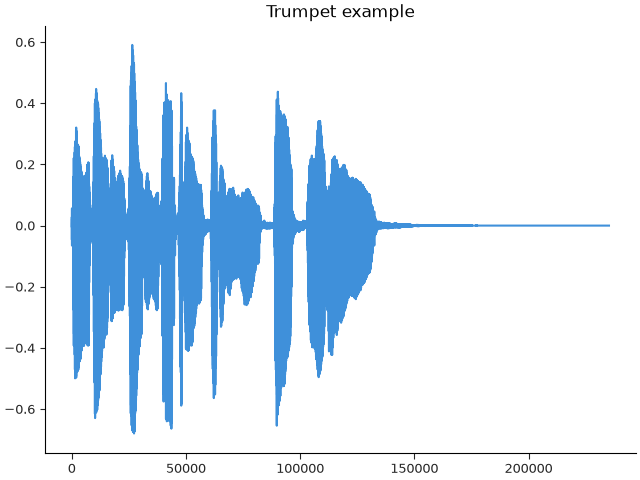
ax.plot(y)
ax.set(title="Trumpet example")
Trumpet example

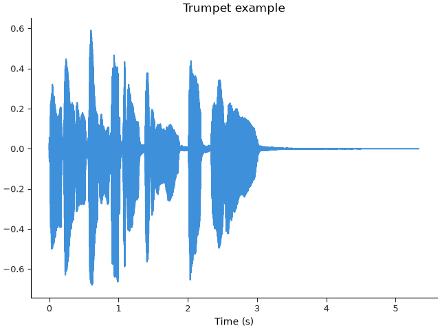
This plot is a reasonable starting point, but it hides an important detail: the horizontal axis is in sample indices, not time. This can be easily fixed by converting the sample indices to time values prior to plotting:
fig, ax = plt.subplots()
times = np.arange(len(y)) / sr  # Calculate sample times
ax.plot(times, y)
ax.set(title="Trumpet example", xlabel="Time (s)")
Trumpet example

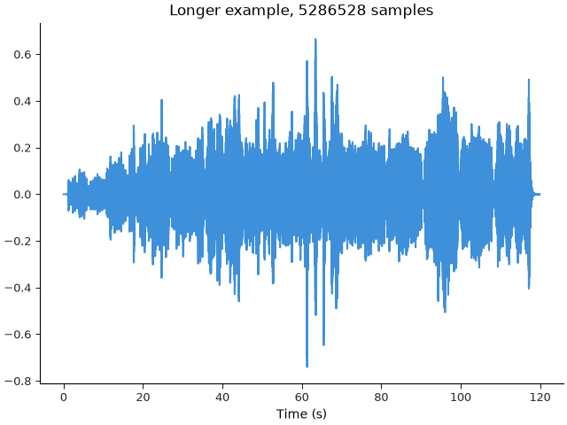
We now have an interpretable time axis, and plotting in natural units makes it easier to link data across multiple displays, which we will see in later sections of this tutorial. We can also discern some information about the signal, mostly to do with timing and amplitude. This works well enough when the signal is relatively short and simple (e.g., monophonic like our trumpet example), but longer and more complex signals present a few difficulties:

  1. The visualization becomes dominated by the largest peaks in the signal, and

  2. The plot itself becomes computationally heavy due to the number of sample points.

To illustrate this, let’s load a longer example.

y, sr = librosa.loadx("nutcracker", sr=None)
HTML(librosa.util.example_info("nutcracker", html=True))
Dance of the Sugar Plum Fairy
By: P.I. Tchaikovsky (composer), Kevin MacLeod (arranger) | License: CC-BY-4.0
Description

Tchaikovsky's piece, amped up a little bit and slightly arranged for more punch and bass.

Instruments: Orchestra, Celesta

(https://incompetech.com/music/royalty-free/music.html)


fig, ax = plt.subplots()
times = np.arange(len(y)) / sr  # Calculate sample times again
ax.plot(times, y)
ax.set(title=f"Longer example, {len(y)} samples", xlabel="Time (s)")
Longer example, 5286528 samples

It’s now much more difficult to identify meaningful visual structure in the plot. It is also much slower to work with interactively (e.g., using Jupyter / IPython interactive plotting).

To address these issues, librosa provides a few display routines tailored for waveform visualization.

Waveshow#

The primary display function in librosa for plotting waveforms is librosa.display.waveshow. It handles time axis conversion and decoration for us, but more importantly, it implements an adaptive envelope plotting algorithm that reduces the complexity of the display while retaining the visual content of the plot.

Under the hood, waveshow summarizes the signal into an amplitude envelope, which preserves the overall shape while reducing the amount of data that has to be drawn.

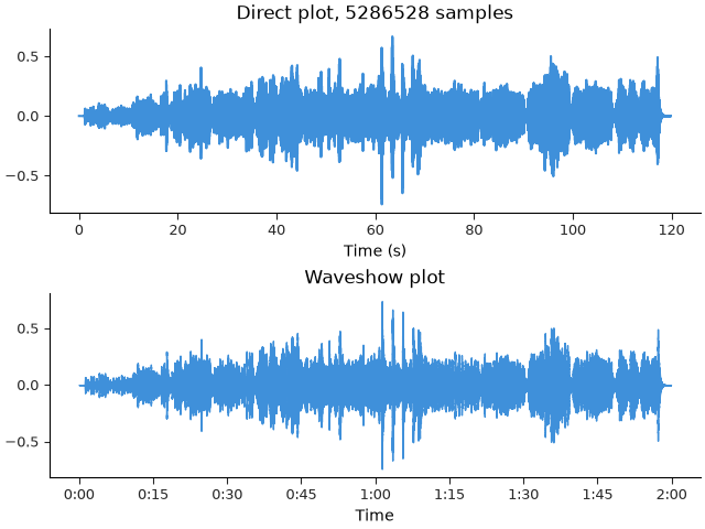
Let’s compare this to the direct plotting approach used above.
fig, ax = plt.subplots(nrows=2)
times = np.arange(len(y)) / sr  # Calculate sample times again
ax[0].plot(times, y)
ax[0].set(title=f"Direct plot, {len(y)} samples", xlabel="Time (s)")

librosa.display.waveshow(y, sr=sr, ax=ax[1])
ax[1].set(title="Waveshow plot")
Direct plot, 5286528 samples, Waveshow plot

The overall structure of the two plots is similar, but waveshow makes it easier to see some of the finer details.

More importantly, the waveshow plot is much more efficient, as it is only plotting the amplitude envelope and not every individual sample.

waveshow still preserves fine detail when you zoom in. At large scales it shows an envelope; at small scales it automatically switches to full-resolution samples in the visible region.

Let’s see an example, comparing the full plot and the waveshow plot, side-by-side.

y, sr = librosa.loadx("trumpet")

times = np.arange(len(y)) / sr

fig, ax = plt.subplots()
# Add some line styling and zordering so that the two plots are distinguishable
ax.plot(times, y, label="Direct plot", linewidth=2, linestyle="-.", zorder=1)
librosa.display.waveshow(y, sr=sr, ax=ax, label="Waveshow plot", alpha=0.5)
ax.legend(loc="upper left")

# We'll zoom in to the middle of the track +- 0.001 seconds
t_mid = len(y)/sr * 0.5

n_frames = 200
window = np.geomspace(t_mid, 0.001, num=n_frames)

def _update(delta):
    """Update the plot for each frame."""
    # The `delta` parameter tells us how far in to
    # zoom the display around the middle time point
    ax.set(xlim=[t_mid - delta, t_mid + delta])
    return None

ani = animation.FuncAnimation(fig,
                              func=_update,
                              frames=window,
                              repeat=False,
                              interval=1000/30)

Indeed, the two plots are identical when zoomed in. Additionally, you might notice that between the zoomed out and zoomed in examples, the time axis is adaptively formatted to label time in human-readable units. This is done automatically by waveshow (and all librosa display functions on time-like axes), but can be easily overridden by setting the axis parameter.

Stylized displays#

Another common visual idiom for audio signals is to represent the amplitude envelope using bars rather than a continuous line. This is essentially an aesthetic choice, but it can be helpful to produce visually simpler plots that are well suited for presentations or diagrams, especially when working with shorter example signals.

We can use librosa.display.wavebars to do this for us. It uses much of the same underlying logic as waveshow, but without the adaptive resolution switching.

fig, ax = plt.subplots(nrows=3)
times = np.arange(len(y)) / sr
ax[0].plot(times, y)
ax[0].set(title=f"Direct plot, {len(y)} samples", xlabel="Time (s)")

librosa.display.waveshow(y, sr=sr, ax=ax[1])
ax[1].set(title="Waveshow plot")

librosa.display.wavebars(y, sr=sr, ax=ax[2])
ax[2].set(title="Wavebars plot")
Direct plot, 117601 samples, Waveshow plot, Wavebars plot

Inverted color displays#

In both waveshow and wavebars, the background of the figure is left blank, while the colored element represents the signal. This is a common visual strategy for scientific plots, especially when multiple signals may be overlaid on the same axes. However, it can become difficult to visually parse when showing multiple signals, and the empty negative space can be put to better use. Many digital audio workstations (DAWs) solve this issue by rendering signals on different figure axes, and filling the background color rather than the foreground color to identify the signals.

Both the waveshow and wavebars functions support this style of display by setting the invert parameter to True. For example, we can visualize the left and right channels of a stereo signal as follows:

y, sr = librosa.loadx("nutcracker", mono=False)

fig, ax = plt.subplots(nrows=2, sharex=True)
librosa.display.waveshow(y[0], sr=sr, ax=ax[0], invert=True, color="C0")
ax[0].set(ylabel="Left channel")
librosa.display.waveshow(y[1], sr=sr, ax=ax[1], invert=True, color="C1")
ax[1].set(ylabel="Right channel", xlabel="Time (s)")
ax[0].label_outer()  # Hide x-axis decoration on the top plot
01 wave

Summary#

In practice, waveshow is usually the best default for waveform display. Use direct plotting when you explicitly want sample-level control, and wavebars when a simplified, stylized view is more appropriate.

Total running time of the script: (1 minutes 32.572 seconds)

Gallery generated by Sphinx-Gallery